Dixon Rye
Branding, Naming, Web, Packaging, Environmental, Pattern
2015
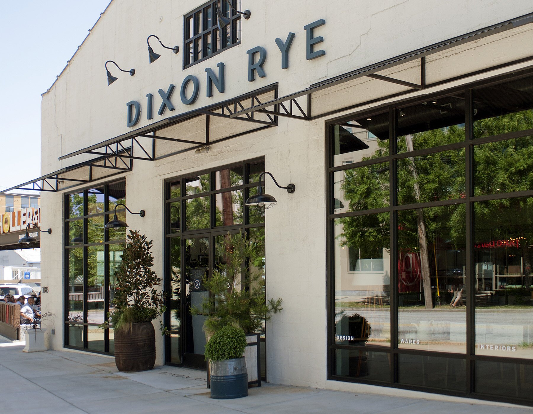
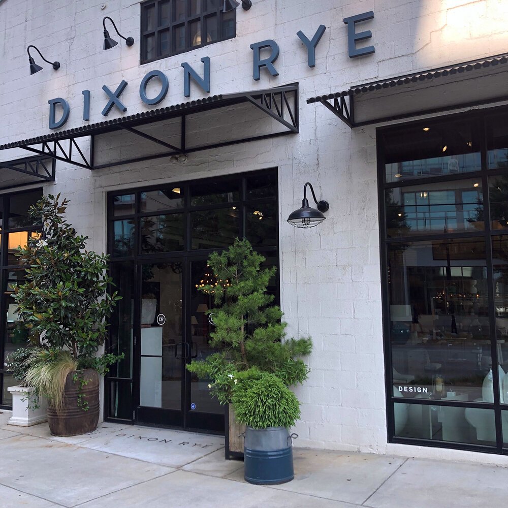
Dixon Rye is a store for interiors, wares, and design in Atlanta founded by Bradley Odom. A sophisticated retail brand in the city’s Westside providing an intentional assortment of heritage-quality home goods — a place to “buy better, fewer things.”
Together with the Dixon Rye team, we collaborated on naming, strategy, messaging, and the overall experience of store signage and retail packaging. And, of course, we also defined a stunning and fitting visual identity system for this new brand.
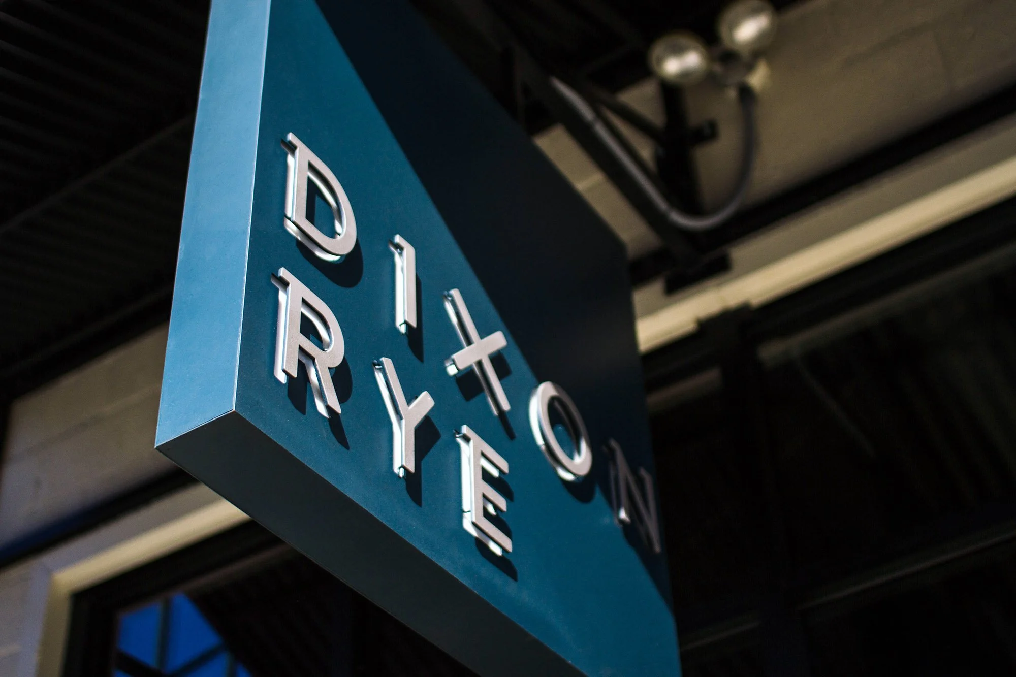
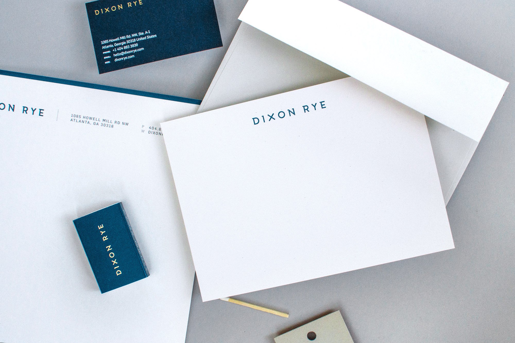
The logotype is a custom demi-serif typeface, uniquely mixing sans- and slab-serifs. The mix of old and new echoes the raw and refined aesthetic with playfulness while remaining decidedly modern.
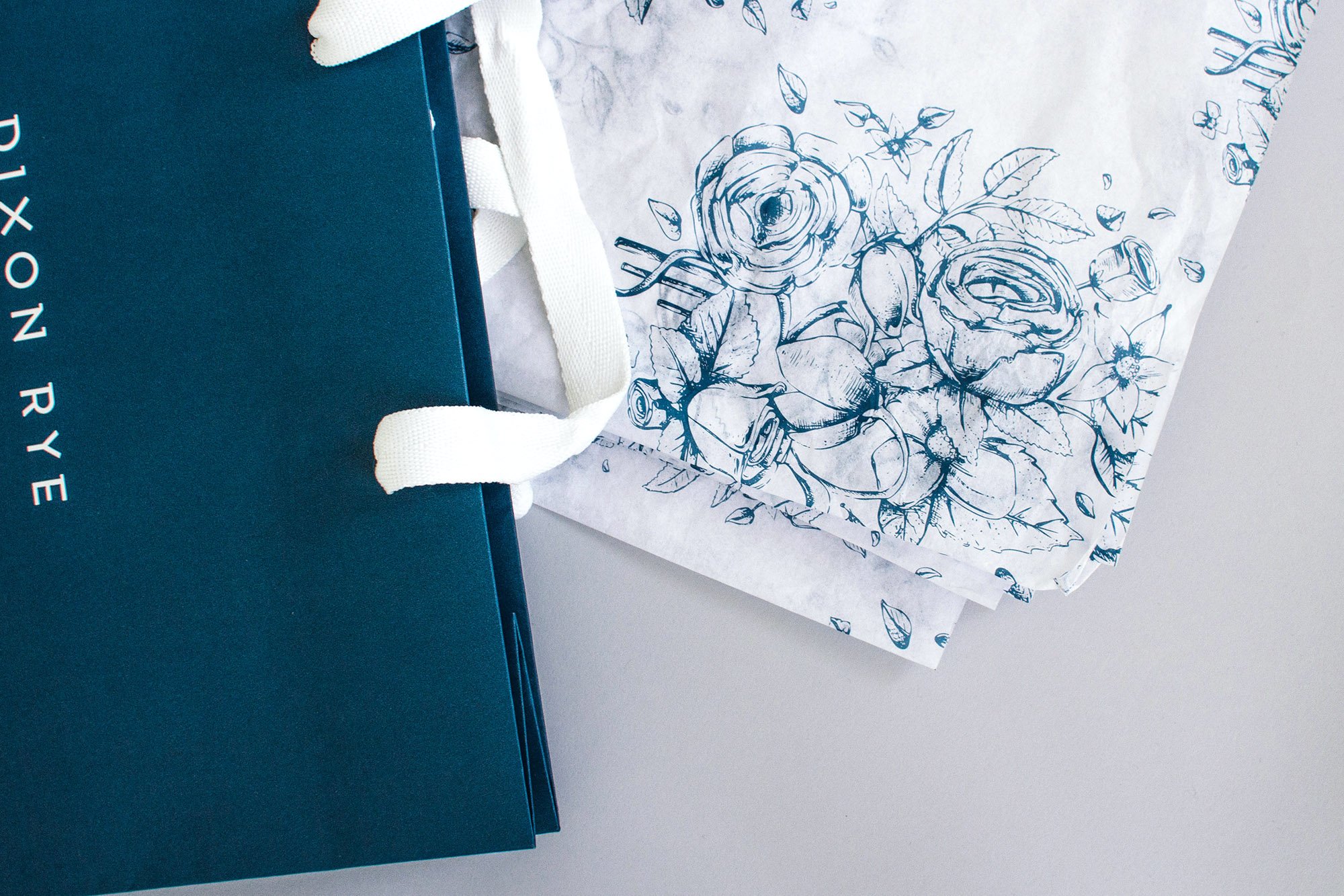
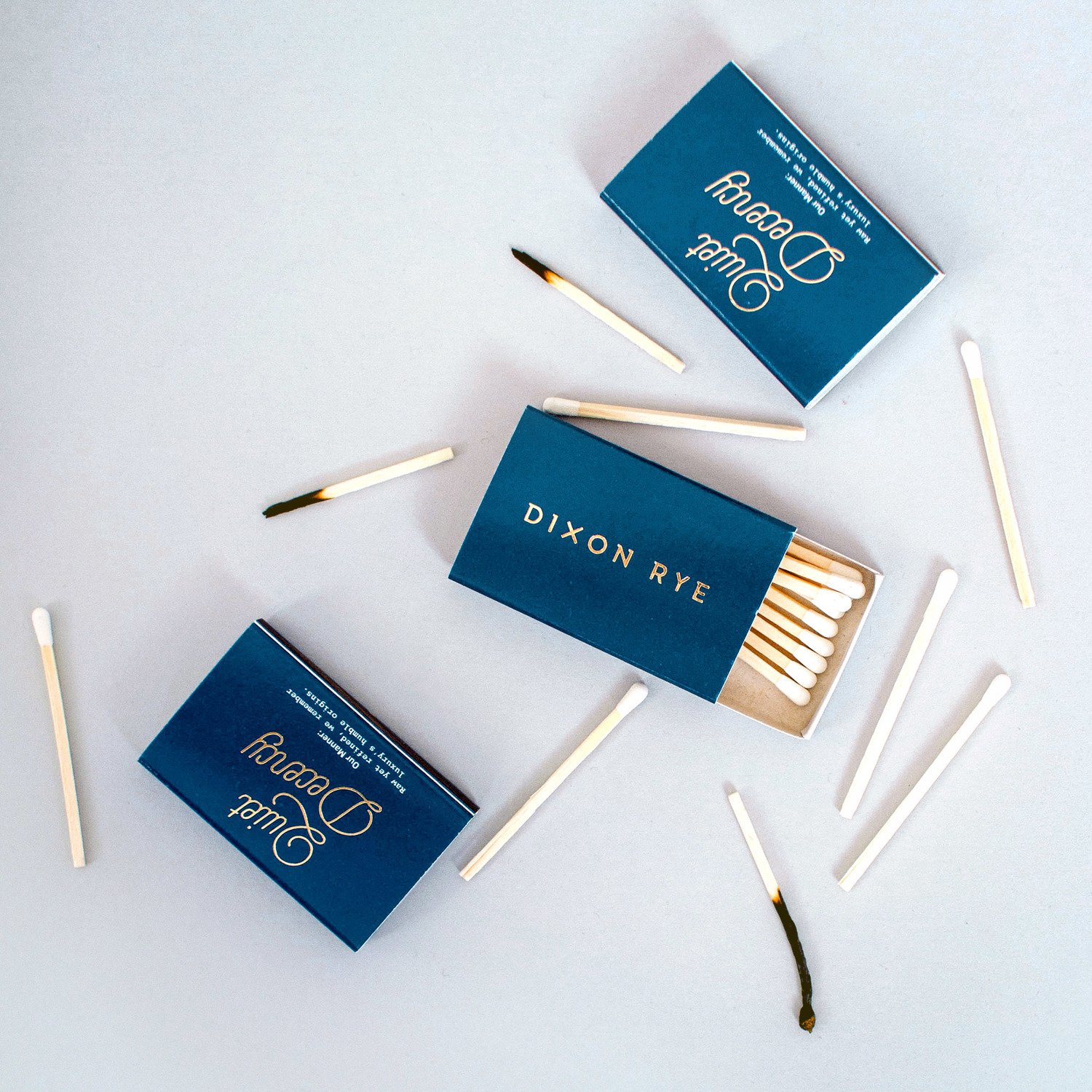
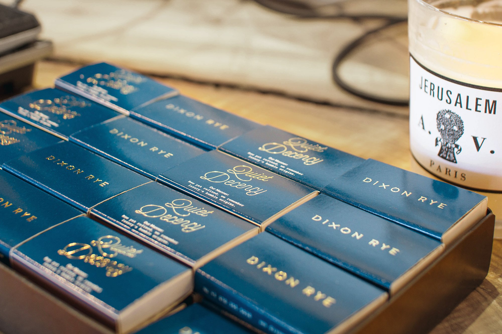
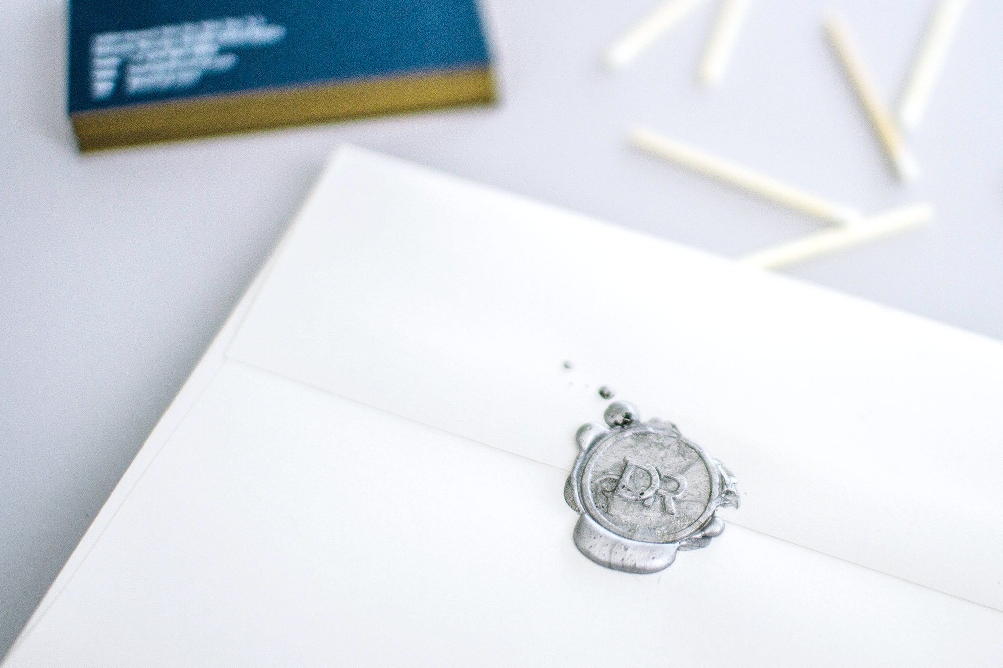
Dixon's Rye rich navy insists a brand that is trustworthy – and is complemented by gold, brass, and silver in various applications. The brand takes inspiration from Southern literaries, especially the figure Atticus in Harper Lee's To Kill A Mockingbird, and this is seen in a vintage, etched feather that becomes a brand icon. The feather is also integrated into a custom floral pattern adorning packing tissue and business cards.


The letterforms are raised from the navy blade sign, with the knockout left behind serving as a window to white lights that shine bright from behind the lettering at night.


“There are two qualities that are imperative for the growth and development of any type of aesthetic presentation. The first is the integrity of both parties involved. The second is an absolute awareness of what the goal is of both parties involved. My goal as a sensitive, creative person is to always present those qualities in the forefront of everything that represents Dixon Rye.
Russell Shaw embodies that same vision, integrity and presentation. He listens, hears, and produces. Russell understood the vision from the very beginning and enhanced it through his ability to create on-brand materials. Russell guided us through a process that resulted in a brand that commands your attention from the first glimpse of the wordmark, to the packaging you leave with after purchasing at Dixon Rye.”
— Bradley Odom
Founder, Dixon Rye


The business cards use French Paper's Nightshift Blue with a metallic gold Pantone screen-printed application of the logo to the front and the custom pattern to the back. The front's information is screen-printed in white ink. The sides are edge-painted with the same metallic gold ink.
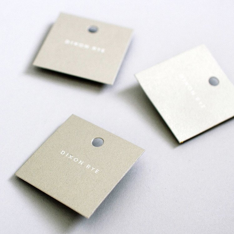
The hang tags use a metallic, champagne-tinted silver which is screen-printed onto the front and back of Neenah Classic Crest Solar White 130lb paper stock (the Solar White lets the logo shine through the light colored background). Unique, one-of-a-kind found objects are marked with an "Antique" stamp in the store.


Credits
Client
Dixon Rye (Bradley Odom): dixonrye.com
Art Director, Designer, Illustrator
Russell Shaw
Photographers
Anthony-Masterson, Lacey Sombar, Sarah Dorio
Production Partners
Mama's Sauce, City Paper Company, Andrew Crawford Ironworks / Iron Is King, Atlas Match, ASAP Signs Marietta, Simon's Stamps
(Special thanks to Steven Fessey, Brad Friedman, Emily DelMarco, Andrew Crawford, Alicia Jenkins, Randy Thompson, and Kevin Ray.)
Awards
2016 Regional Design Awards Winner (Print Magazine)
2016 Silver ADDY Award (Atlanta Advertising Club). Integrated Brand Identity Campaign.
2016 American Package Design Award (GDUSA, New York)
Branding Served: Feature
In Print
Print Magazine's Regional Design Annual, December 2016. The South.
GDUSA‘s 2016 American Package Design Awards Annual (GDUSA).