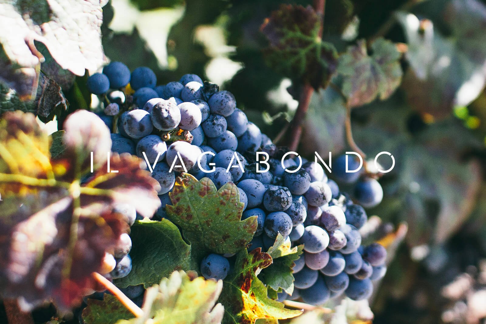
Il Vagabondo Wine
Branding, Packaging
2014
An image and identity for a single-vineyard, limited edition winemaker producing one red and one white cuvée per year from the vineyards and olive groves of western Liguria, Italy.
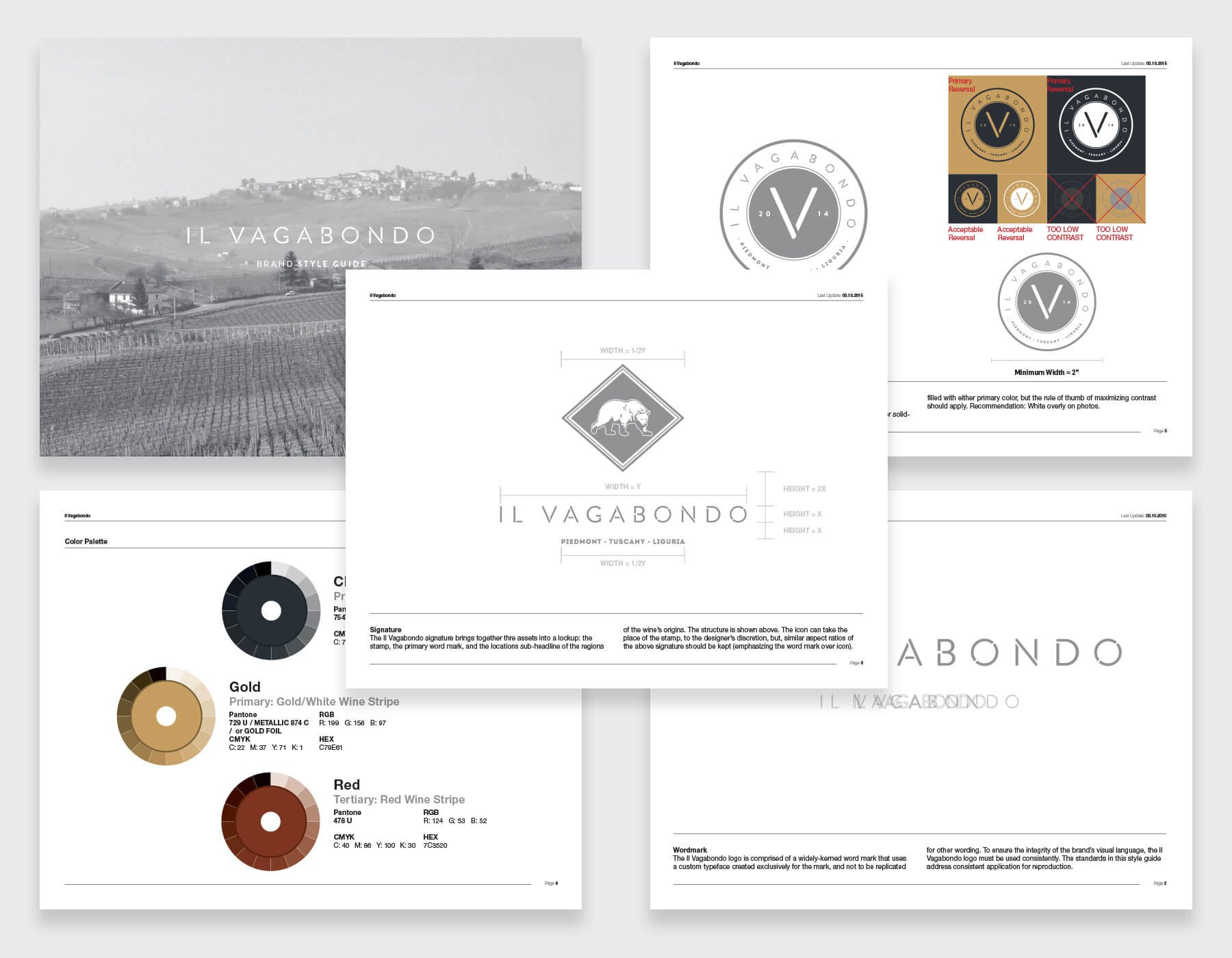
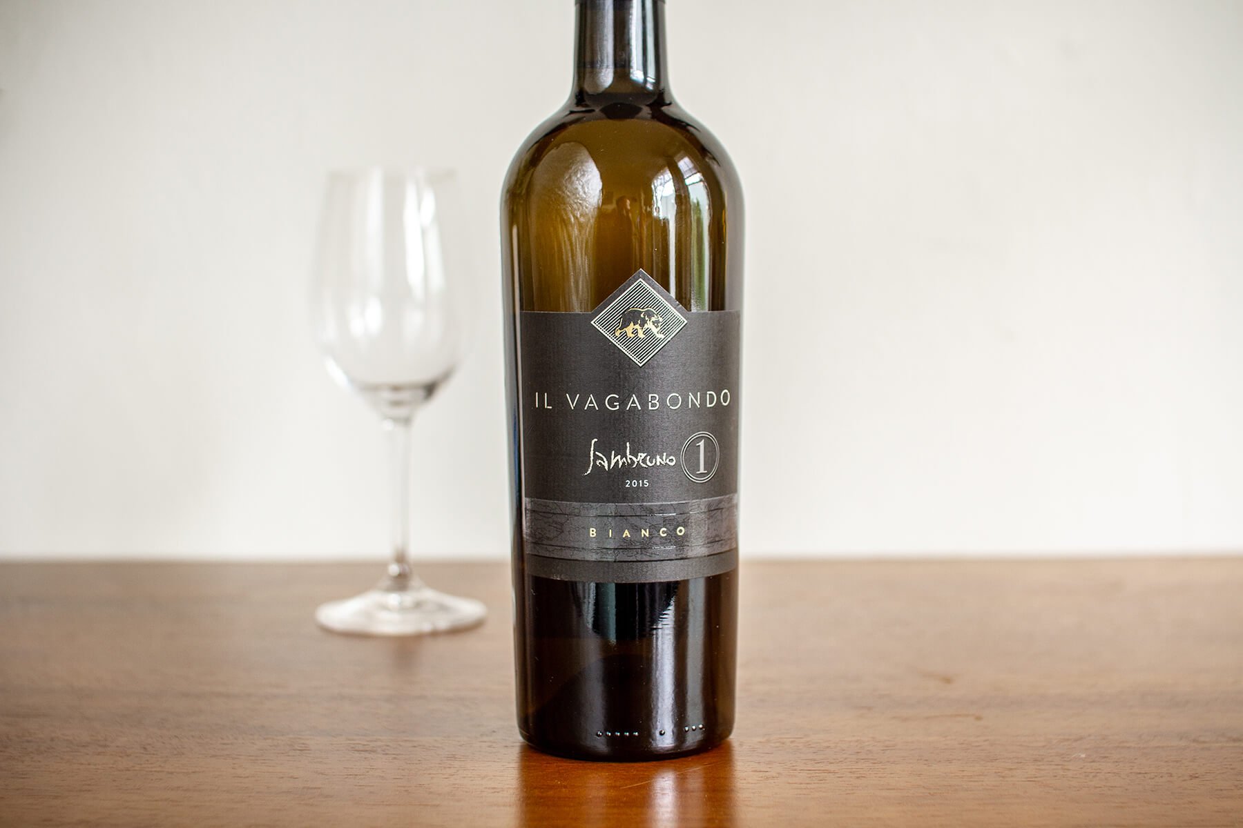
I worked with the winemaker and creative directors to craft an identity built around the image of a polar bear – a nomadic creature who would be a fitting representation of a roaming and adventurous vagabond.
The logotype features a custom-made, attractive, sans-serif typeface with a stencil-like finish. This reinforces ideas of craftsmanship, and the wide-tracking of the letters promotes an image of a higher-end product.
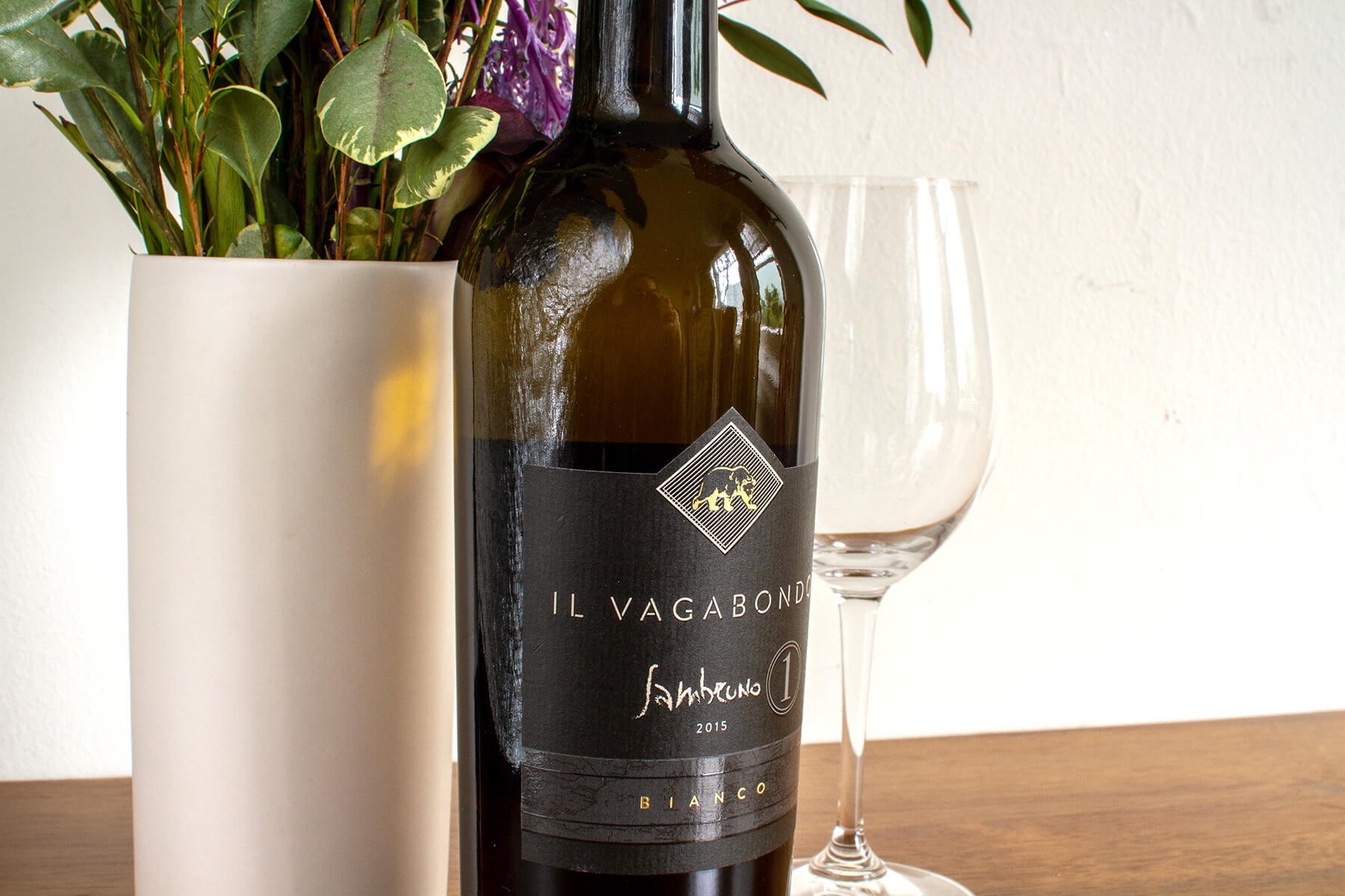
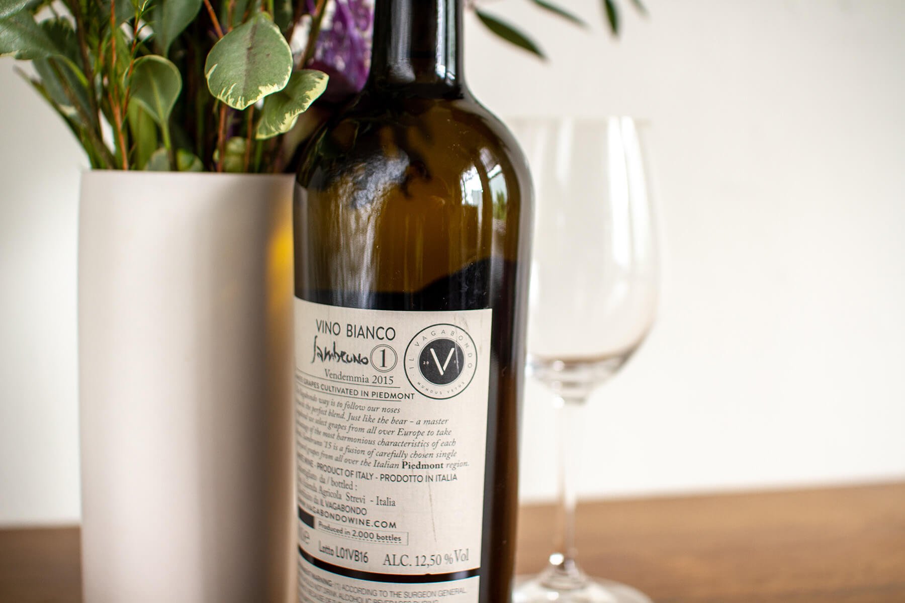
The gold finishes, spot varnishes, custom diecuts and textures of the label bring all of the visual design assets home to an overall package design that matches the high-quality and higher-pricepoint of the end product.