Banner Day
Branding, Guidelines, Web
2021
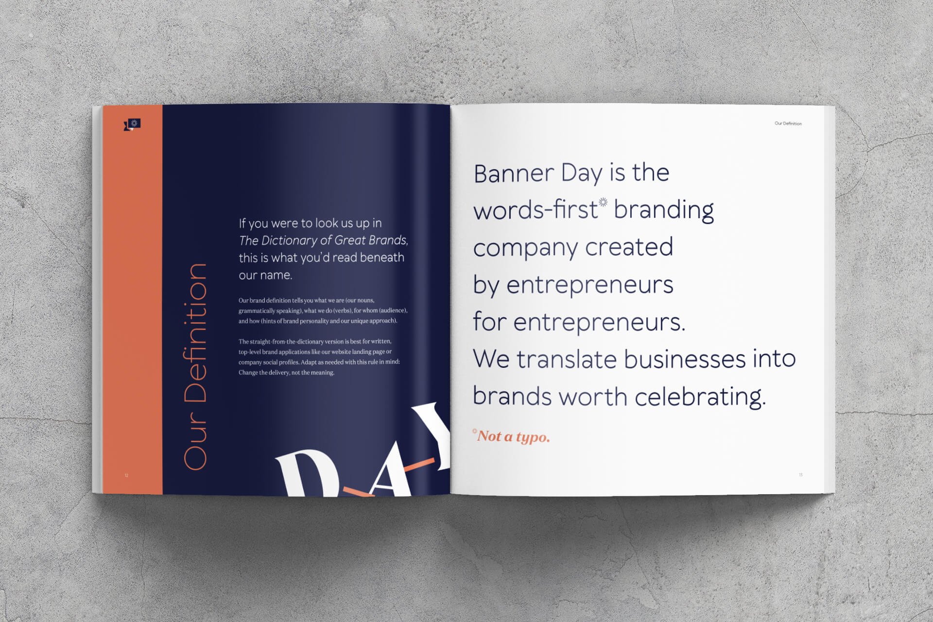
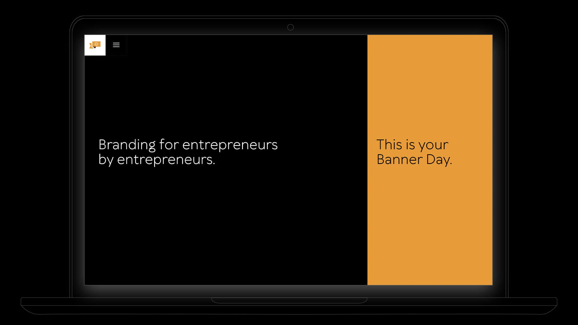
Banner Day is a branding agency that takes a words-first approach to brand creation: focusing on helping organizations translate their businesses into brands with meaning through defining and refining effective naming, messaging, and strategy.
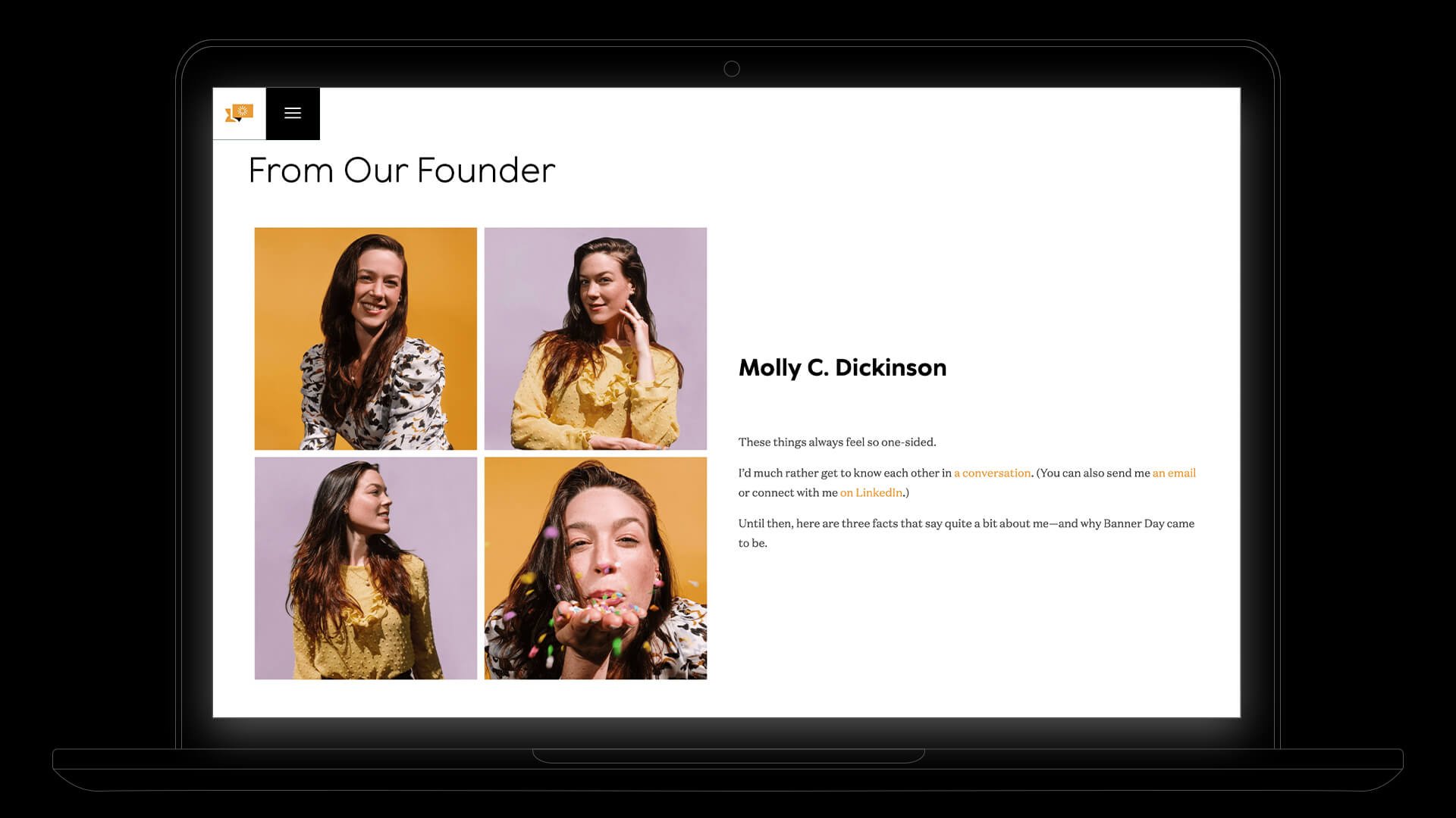
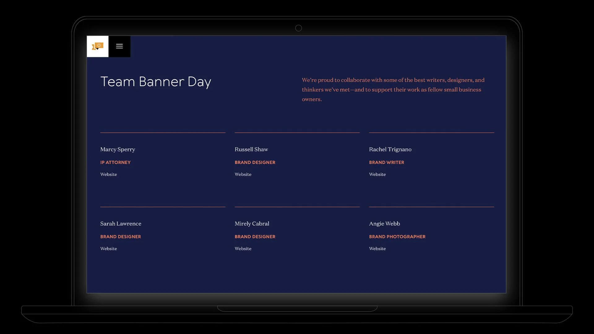
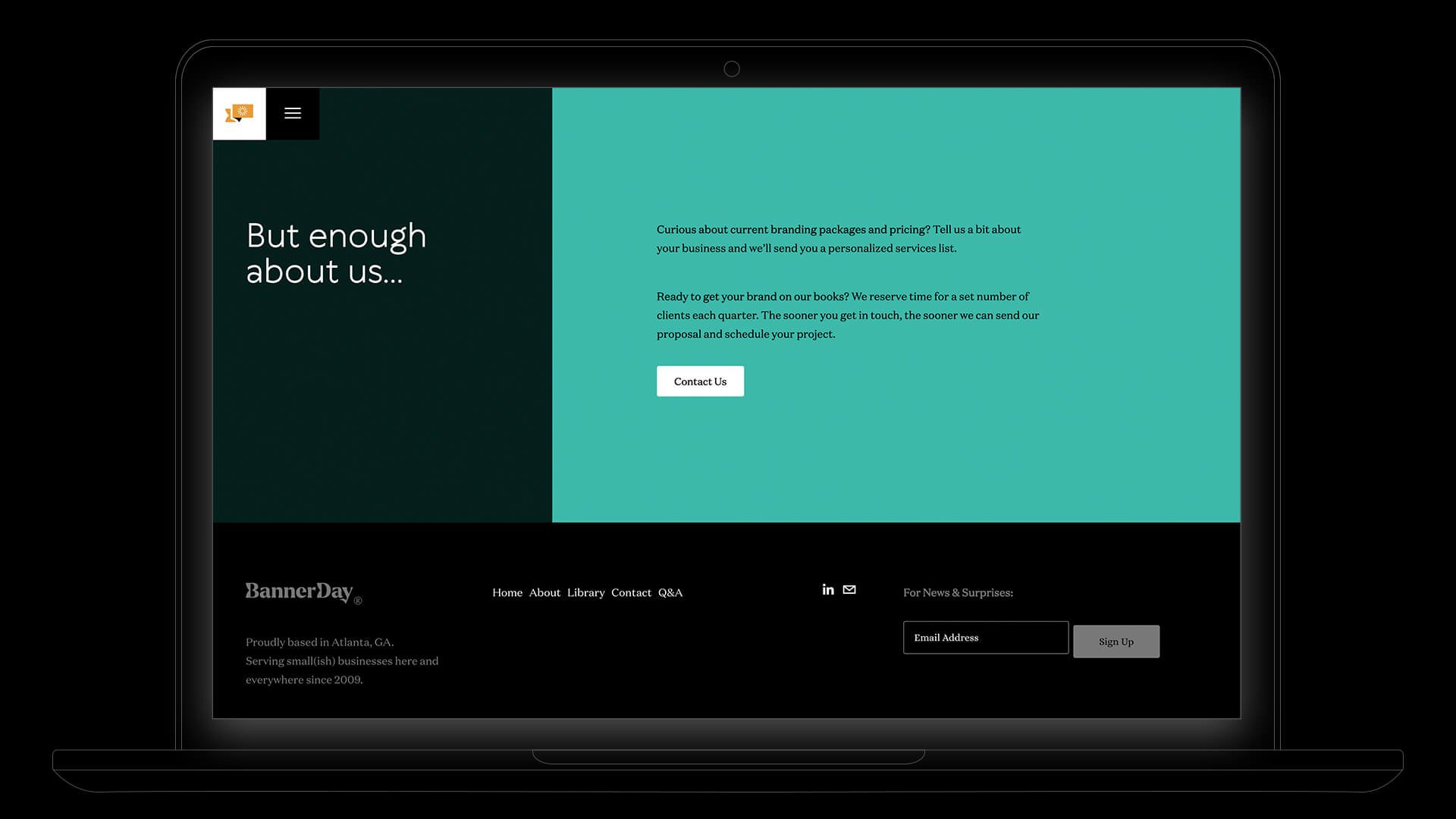
I designed the visual identity — from the core assets of the logo to the graphic treatments of the brand’s sunburst as an asterisk, the letter confetti, and the “wordscape” illustrations — to highlight the unique language-inspired nature of the agency, wrapped in a warm and optimistic color palette meant to make the process of branding feel like the delightful work that it can be when done well. I then translated the identity across a full suite of collateral, brand guidelines, and the website.
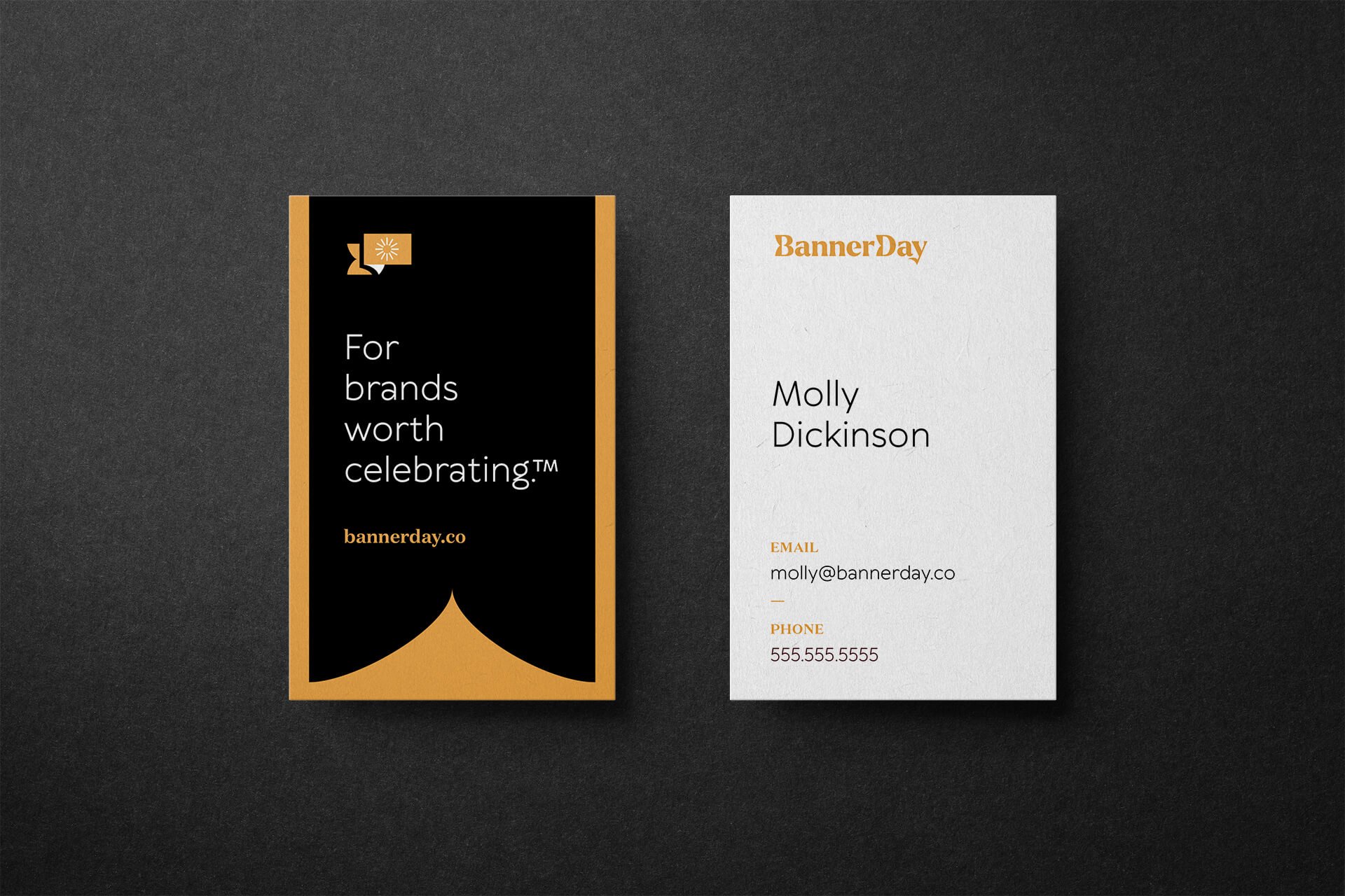
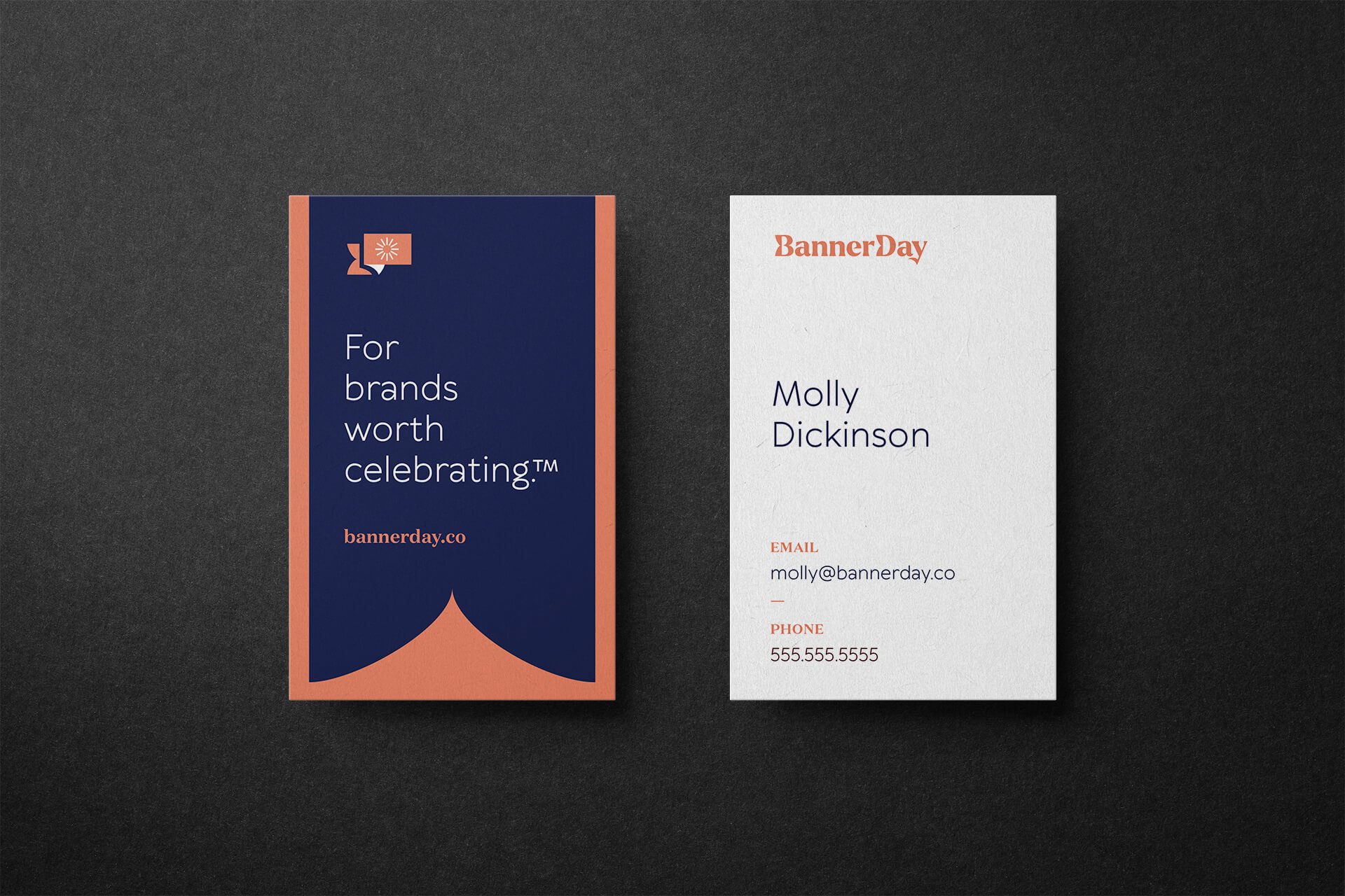
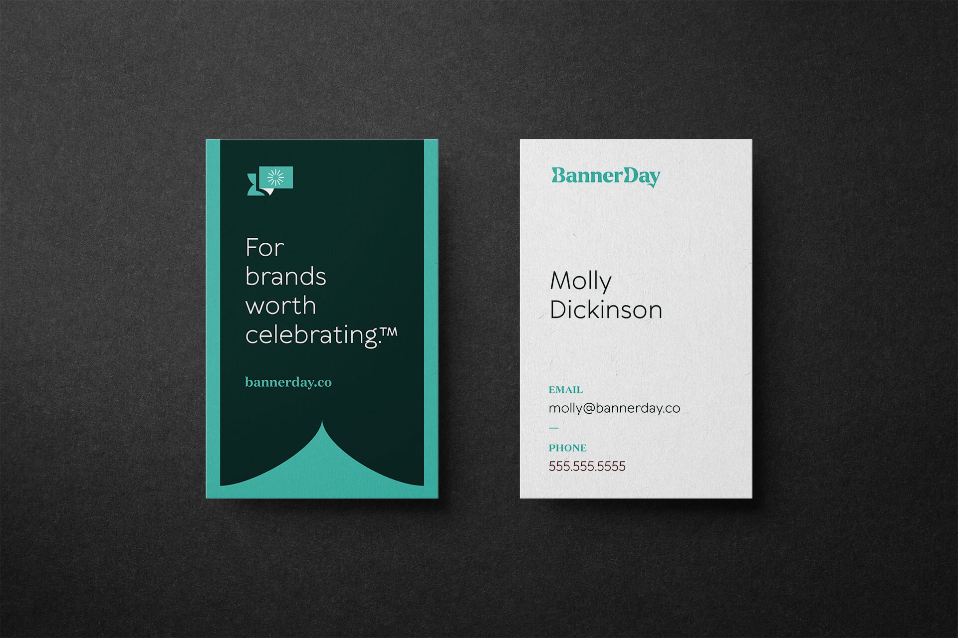
The icon is designed to be an abstract speech bubble — emphasizing messaging — that has a tail like a banner waving off to the left. In the center of the speech bubble is a custom, sunburst-asterisk mark. The wordmark features a customized “B” and “D” that echoes the same banner tail shape, and a unique “y” at the end with a descender that waves like a flag as well.

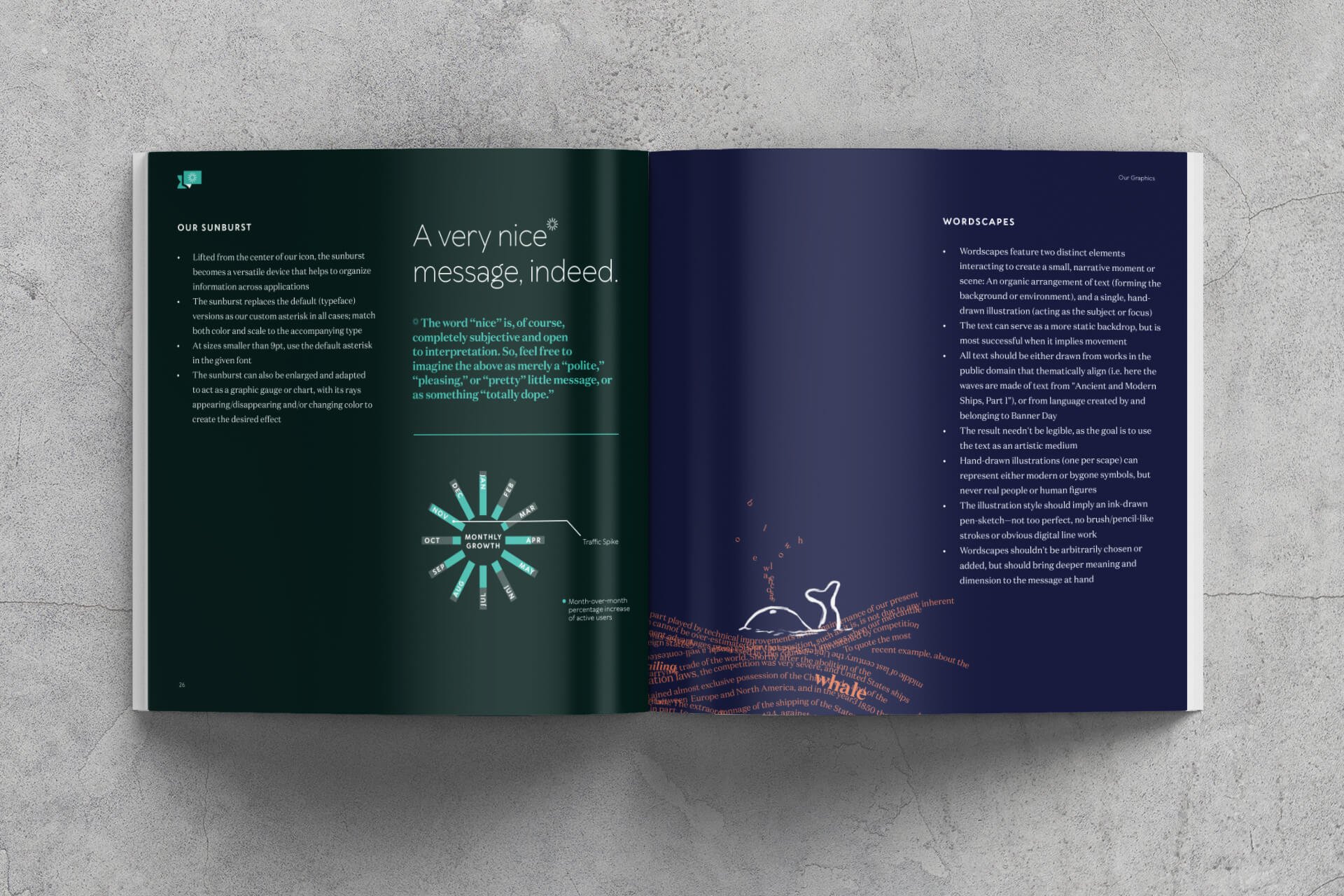
The Sunburst-Asterisk
Lifted from the center of our icon, the sunburst becomes a versatile device that helps to organize information across applications. The sunburst replaces the default versions as our custom asterisk in all cases; match both color and scale to the accompanying type,

Letter Confetti
An alphabet soup of organically-yet-orderly arranged capital letters and em dashes act as patterns and marginalia in the designs to further emphasize the messaging-centric nature of the words-first branding work.
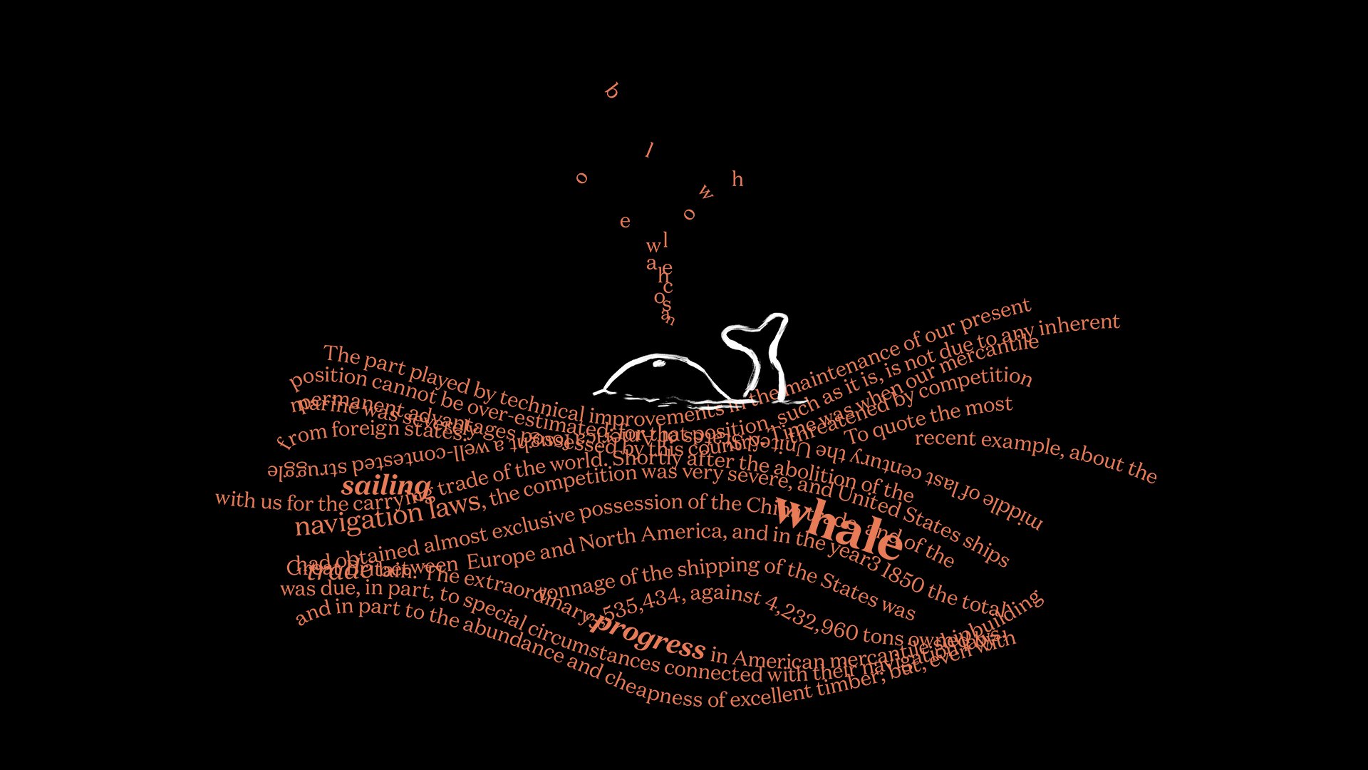
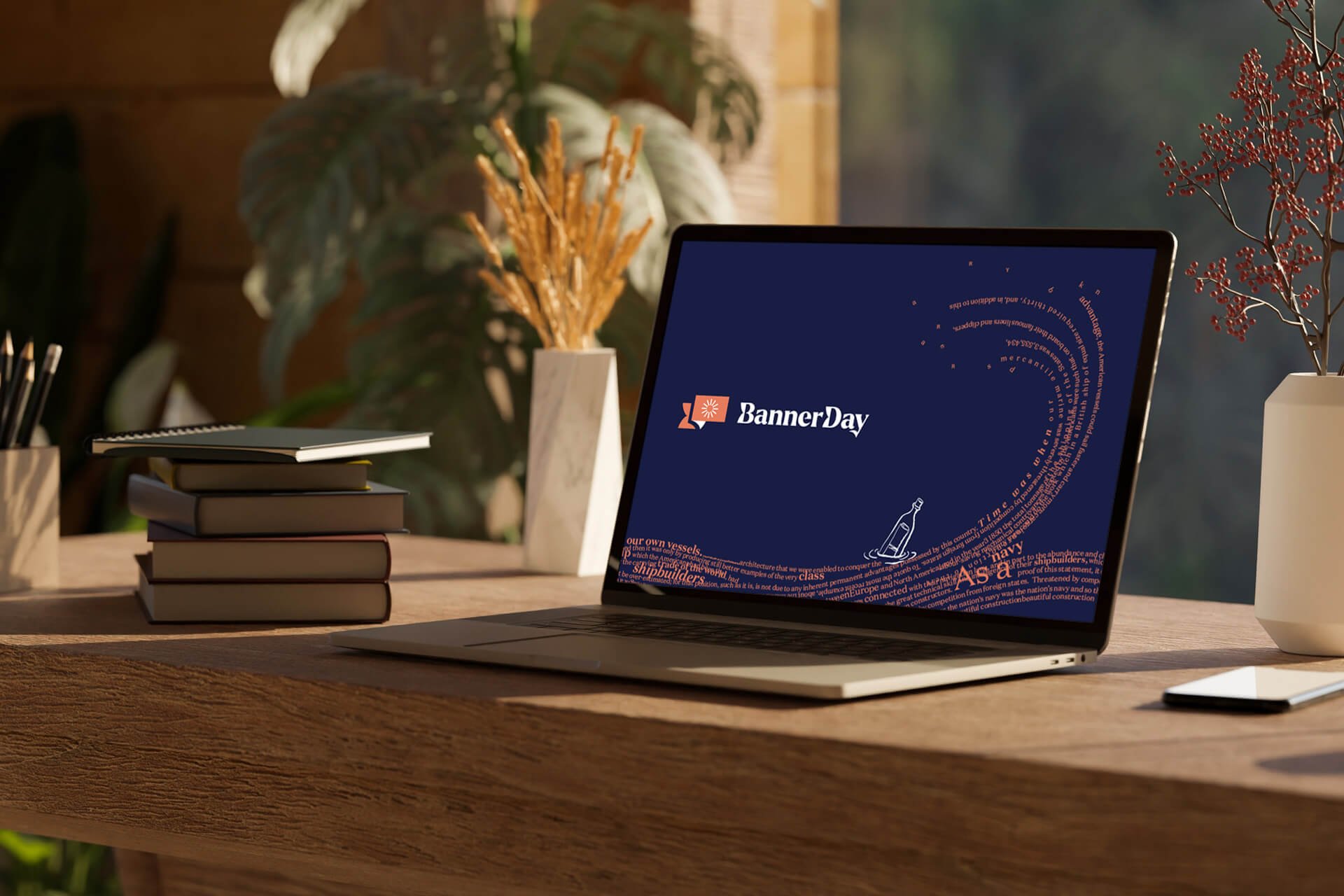
Wordscapes
Wordscapes create a small, narrative moment or scene by combining: an organic arrangement of text (from a public domain literary piece with a subject matter that relates to the scene at hand) which forms the background or environment; and a single, hand-drawn illustration which acts as the subject or focus. The wordscape needn't be legible, but creates custom artwork that deepens the message of the surrounding branded communication.